Opening the can of tooltips
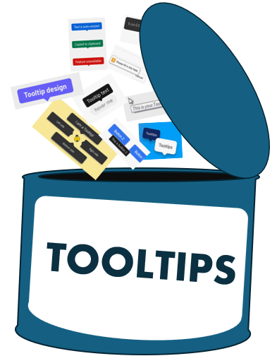
Last week, I opened a can of worms. I asked on social media:
Sometimes all you need is a trustworthy
titleHTML attribute for a text-only tooltip. Only problem is: it can't be styled! Do you want these tooltips to be stylable? Maybe with a ::tooltip pseudo?
See the threads on Mastodon and on Bluesky.
If only styling was the only problem! I quickly realized that I hadn't had to think about tooltips on the web for a long time. Turns out, the title attribute is strongly discouraged for most use cases, and for good reasons, which I think are:
- Native tooltips look bad.
- They can't be styled to match the rest of the page.
- They're not accessible to all users.
- Many accessibility specialists, and the W3C itself, discourage relying on tooltips for accessibility reasons.
So it's not a surprise that many developers don't use native tooltips that rely on the title attribute. And, when they do, it's often for the wrong reasons. Here is some data to back up this claim.
Usage of the title attribute on the web
According to the 2024 Web Almanac, which is based on millions of web pages of all kinds, the title attribute is present on 2% of web pages only.
I wanted to learn more, so I ran my own analysis on Tranco's top-5000 domains. Focusing on top sites, rather than all sites, is bound to reveal different results than the Web Almanac, and in this case way more title attribute usage. But it gave me a way to understand where and why the attribute is used. Here are the key findings:
-
Usage is dominated by
<a>(71%) and<img>(12%). -
For both elements, most title attribute values are redundant:
~70% of
<a title>and ~76% of<img title>carry no meaningfully new information beyond what's already available via other means (link text oraltattribute). -
Cases where the title attribute is genuinely different include:
- Disclosure of click/interaction behavior
- Attribution/credit
- Restating a truncated or iconic label in full
- Editorial/internal metadata that leaked into the front end
All of which also have a more accessible native alternative:
aria-label,aria-describedby, a visible caption, or just fulleraltattribute or link text.
So, developers don't really like the title attribute, and even those who do don't use it correctly.
Accessibility issues with title attribute tooltips
Others say it better, for example check out The Trials and Tribulations of the Title Attribute, but here is what I learned over the past few days regarding the accessibility issues with title attribute tooltips:
- They're not accessible to keyboard users. Only Microsoft Edge displays the tooltip when the element receives keyboard focus.
- They're especially not accessible to keyboard users when used on elements that aren't focusable.
- Tooltips aren't dismissed when using the Escape key, and you can't move your mouse over the tooltip area without it disappearing.
- They're not consistently announced by screen readers.
- The title attribute sometimes overrides an element's accessible name.
- They don't honor the zoom level.
There's still a need for tooltips
Developers' interest in tooltip libraries is still very high. Just because developers don't use the title attribute doesn't mean that they don't need tooltips, or that all tooltip use cases are bad.
For example, the Radix UI React tooltip is downloaded 57M times per week. This particular library offers a simple way to create tooltips in React, which are fully stylable via CSS, and which follow the tooltip pattern from the Aria Authoring Practices Guide.
What are tooltips good for anyway?
There's a few good reasons for wanting to display a tooltip. This list is from Tooltips & Toggletips:
-
Labeling icon-only controls:
A button represented only by an icon. The tooltip provides the missing label, such as "Notifications" or "Settings".
-
Providing extra clarification about a control:
The control already has a label, but some additional explanation may help. For example when the label says "Notifications", the tooltip could say "View notifications and manage settings".
-
Dense toolbars where visible text truly won't fit:
For example, WYSIWYG editor toolbar with many controls.
What should we do?
Developers today either use libraries, or roll out their own code, perhaps using new built-in web features like Popover and Anchor Positioning. And that's great, these approaches give developers a lot of power and flexibility.
They also come with drawbacks: are you certain that your custom tooltip is fully accessible? Are you OK with sending and running a bunch of JavaScript code just to display a tooltip?
I think we should provide a built-in tooltip on the web, and make it fully accessible and customizable. If we did, I know usage would increase significantly, helping developers maintain less code, and making pages more accessible and faster to load.
My colleagues on the Edge Web Platform team think so too! And we've been proposing a feature for this for some time.
So what would it take to make native tooltips fully accessible and customizable on the web?
Customizing the tooltip's style
The fact that native tooltips look bad and aren't customizable can be addressed together as one by letting developers style tooltips via CSS, and specifically, via our proposed ::tooltip pseudo-element.
The proposed mechanism for this is similar to how customizable <select>s work: you first opt-in to the new base tooltip system, and then style the tooltip to your liking.
On the Edge team, our feature proposal currently looks like this:
<style>
::tooltip {
  /* Opt-in to the base style */
  appearance: base;

  /* Customize the tooltip */
  ... your own styles here ...
}
</style>
<button title="This is a tooltip">
  Hover me
</button>
But I think there's another possible approach, which wouldn't require using appearance and also wouldn't suffer from the uphill battle of having to convince everyone that the title attribute is good now, actually. Introducing a new attribute:
<style>
::tooltip {
  /* Customize the tooltip */
  ... your own styles here ...
}
</style>
<button tooltip="This is a tooltip">
  Hover me
</button>
One issue with this though is that we'd have to deal with cases where both the title attribute and the new tooltip attribute are present on the same element. A solution to this would be to prefer the tooltip attribute over the title attribute when both are present.
Customizing the tooltip's behavior
Customizing tooltips is not just about changing the border, the padding, or the colors. Many developers also want to be able to control the position of the tooltip, and the delay before it appears and disappears.
The way we're thinking about this is by making the tooltip internally use existing capabilities of the web:
-
For positioning:
We can make the tooltip pseudo-element anchored to its host element, by using CSS Anchor Positioning, therefore giving developers control over where the tooltip appears relative to its host.
You wouldn't have to establish the relationship yourself. The browser would handle it for you.
-
For controlling the delay, we could either transition the tooltip's visibility, or use Interest Invokers.
I like the Interest Invokers approach because, once again, the browser would automatically make the host element be the interest invoker, and the tooltip pseudo-element the interest target, letting you simply use the
interest-delayCSS property right away.
Addressing accessibility issues
Now comes the more complicated part. How do we make this notoriously tricky feature accessible to all users?
Dealing with the keyboard
Leveraging existing platform capabilities gets us part of the way there. We can make the tooltip pseudo-element be a popover and an interest invoker target of the host element.
Just by doing this, we get keyboard accessibility for free. The tooltip appears when the host element receives keyboard focus. It can be dismissed by pressing Escape, and it remains visible as long as you keep the focus on the host element, including if you move your pointer over the area of the tooltip.
What about non-focusable elements then? I argue that this should be out of scope, and continue to be an actively discouraged pattern. If an element isn't focusable, what information do you absolutely need to convey through a tooltip, which you can't convey through other means?
To make sure that our new tooltip doesn't exclude users because of this, I argue that it should only be available to certain elements. Those that come to mind:
<button><a><input><textarea><select>
Images are a common use case for title attribute tooltips, but doing this should also probably be discouraged. Reasons for using a title attribute on an image include providing alternative text, which is done better by alt, or providing supplementary information, which should be done through other means, such as a caption or a figure description.
Touch devices
What about touch devices then? Tooltips should be accessible to all, and touch devices are no exception.
This isn't something new with this proposal. Any content which appears only on hover can't work on devices which don't support hovering.
Possibly, long pressing on an element could trigger a menu that displays the tooltip content. Mobile devices already do this for images.
But, beyond this, I think that this should continue to be addressed by web developers themselves, by providing the same content in an alternative way, for example by using the hover or any-hover media queries.
Screen readers
Screen-reader support for tooltips should be consistent. Inconsistencies mostly stem from bad use of the title attribute today, which should continue to be discouraged. For example:
- Screen readers don't announce the content of a title attribute on an inline text level element.
- Screen readers don't consistently announce the title attribute on block-level elements.
- Screen readers sometimes announce the same content twice when title duplicates a link text or an image alternative text.
Limiting the new tooltip to interactive elements would improve things here. But also, one can hope that the same mistakes that were made with the title attribute are avoided this time.
General accessibility guidelines
The new tooltip should satisfy general accessibility guidelines, such as:
- Tooltips should not override an element's accessible name.
- The tooltip should be given the role
tooltip. - The element that triggers the tooltip references the tooltip element with
aria-describedby.
Starting fresh, either by introducing the new tooltip attribute, or by using the appearance:base opt-in makes it easier for us to implement things right this time.
Zoom level
If the new tooltip is a popover, this gets fixed automatically. The font-size inherits from that of the surrounding content, user preferences, and zoom level.
Conclusion on accessibility issues
I'm no accessibility specialist, and I might have missed important considerations. But I believe that we can build something that's a million times more accessible than the current native tooltip implementation.
Carving an easy path from simple to rich tooltips
Another consideration here is making it easy for developers to start with a simple tooltip and then enhance to richer content when necessary.
Sometimes all you need is a string, and it should be very easy to do that. But then, later, someone asks you to add an innocent little label or keyboard shortcut to your tooltip. And suddenly, your solution no longer works because simple tooltips only accept plain text, not HTML.
With our proposed solution, which is based on popover, anchor positioning, and possibly interest invokers, then the upgrade path would be very simple. Let's take a starting example (I'm assuming here that we'd go for the new tooltip attribute):
<style>
  button {
    /* Customize the delay. Elements with [tooltip] are interest invokers */
    interest-delay: .25s;
  }

  ::tooltip {
    /* Style the tooltip, just like any element. */
    background: #333;
    color: #fff;
    border: 0;
    border-radius: 10px;
    padding: 10px;
    box-shadow: 0 4px 8px rgba(0, 0, 0, 0.2);

    /* Position the tooltip relative to its anchor element.
        The tooltip pseudo is auto-anchored to the parent element. */
    position-area: bottom;
    margin-block-start: 10px;
  }
</style>
<button tooltip="This is a simple tooltip">Hover me, I have a single-line tooltip</button>
Now let's say that you want to add some HTML to the tooltip content. First, you'd need to remove the tooltip attribute and use a popover instead. But also, you'd need to link the trigger element to the popover using the interestfor attribute:
<!-- Use interestfor to link the button with the tooltip -->
<button interestfor="my-tooltip">Hover me, I have a rich HTML tooltip</button>
<!-- Use popover to make the div be a rich tooltip -->
<div id="my-tooltip" popover>This is a rich tooltip with <span>HTML</span></div>
But the beautiful thing is that apart from this, most of your CSS code would remain the same, apart from the selectors changing from ::tooltip to [popover]. Indeed, your tooltip now is a real HTML element, not a ::tooltip pseudo-element created by the browser for you. Everything stays the same, and all styling, timing, and positioning rules still apply:
<style>
  button {
    /* Customize the delay. Elements with [tooltip] are interest invokers */
    interest-delay: .25s;
  }

  [popover] {
    /* Style the popover element, just like you did the ::tooltip pseudo before. */
    background: #333;
    color: #fff;
    border: 0;
    border-radius: 10px;
    padding: 10px;
    box-shadow: 0 4px 8px rgba(0, 0, 0, 0.2);

    /* Position the tooltip relative to its anchor element.
        The popover is automatically anchored to the host element. */
    position-area: bottom;
    margin-block-start: 10px;
  }
</style>
Let us know what you think
How does the proposal sound? I'd love to hear your thoughts and feedback. Also, I'd love to hear if you'd use this.
The easiest way is to drop us a comment by opening an issue on our explainers repo.