Do you really understand CSS radial-gradients?
Seven years ago, I taught myself all about CSS linear gradients and, ever since, I've been meaning to learn more about how radial gradients worked as well. It took me a long time to find an excuse to dig deeper into the logic behind it but I'm very thankful I did.
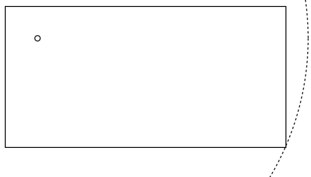
To learn how to use the radial-gradient CSS function, I attempted to draw a pair or eyes, only with CSS, just one element par eye, and only using radial gradients. Here is the result (it's an iframe, so go ahead and use DevTools to see how it works if you want).
Sure, this isn't the best drawing of human eyes you've ever seen (plus, it doesn't render properly in Safari, see why in the browser support section), but it did help me understand a lot more about how radial gradients worked and, with this article, my hope is that you too can learn a thing or two about them.
High-level syntax description
At a high level, here is what the radial-gradient syntax looks like:
radial-gradient(<shape> <size> at <position>, <color-stops>);- Shape. The shape of the gradient. This defaults to an ellipse, but can also be a circle. The colors defined in the gradient will be displayed in concentric layers inside this shape.
- Size. The size of the gradient shape. This corresponds to the outer-most concentric shape where the 100% color stop would be positioned.
- Position. Where the gradient shape is positioned. By default the gradient shape is centered in the gradient box, but you can choose any position you want.
- Color stops. The list of colors you want to use in the gradient. The colors should be listed from the inner-most to the outer-most. The first color will start at the center of the shape.
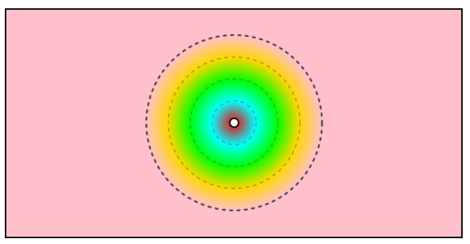
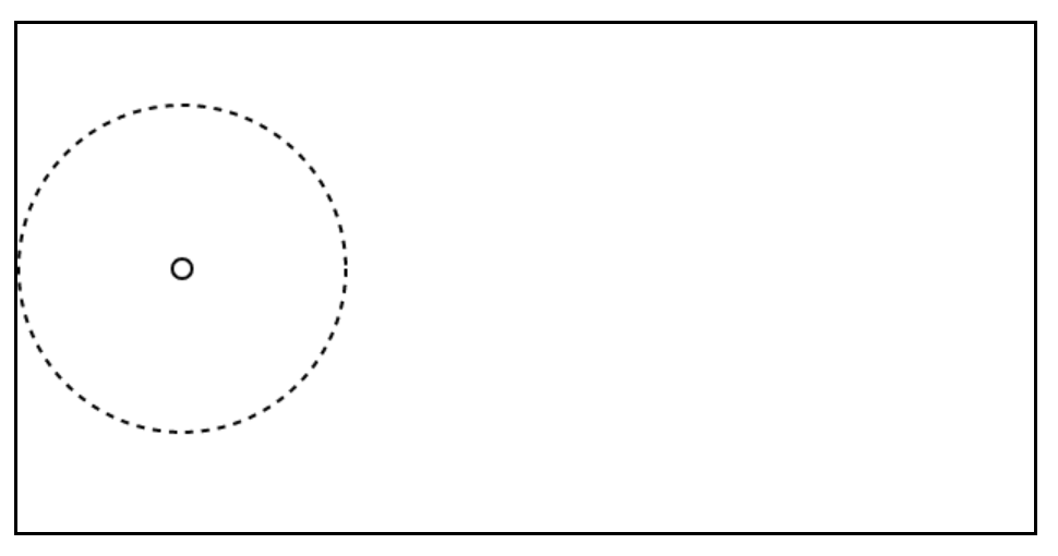
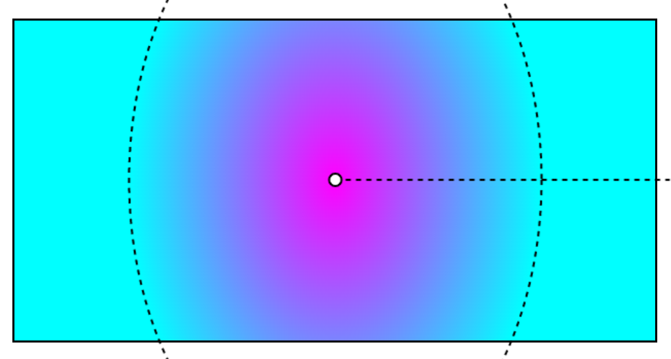
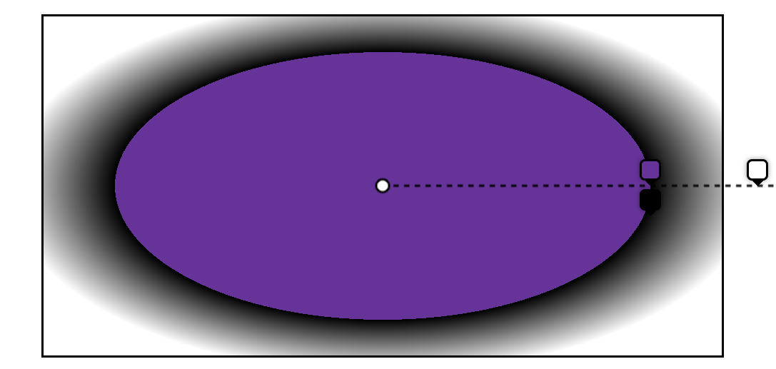
Let's illustrate this a little bit to help make sense of this:
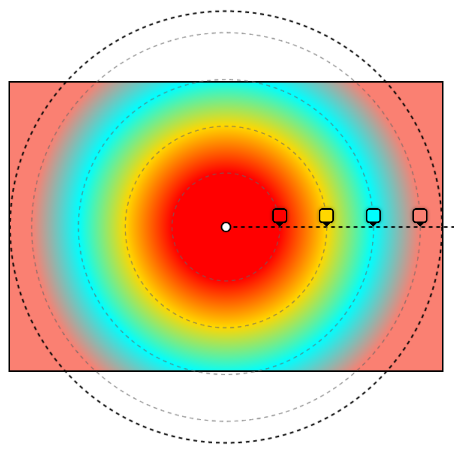
In the above example, we've drawn a circle gradient. The rectangle is the gradient box (which we'll define in a second), the white dot is where the gradient is positioned, the horizontal line is the gradient ray (also defined later), the thick outer-most circle is the gradient shape, and the gray inner-circles represent where the color stops are positioned.
Now, let's define these various parts in more details.
The gradient box
A gradient image has no dimensions, it is infinite, unlike traditional background images. What gives a visible dimension to the gradient is its gradient box i.e. the area where it is displayed.
Usually, the gradient box is the border-box of the element which the background is applied to. That's the same area where a background-color or an background-image would be displayed.
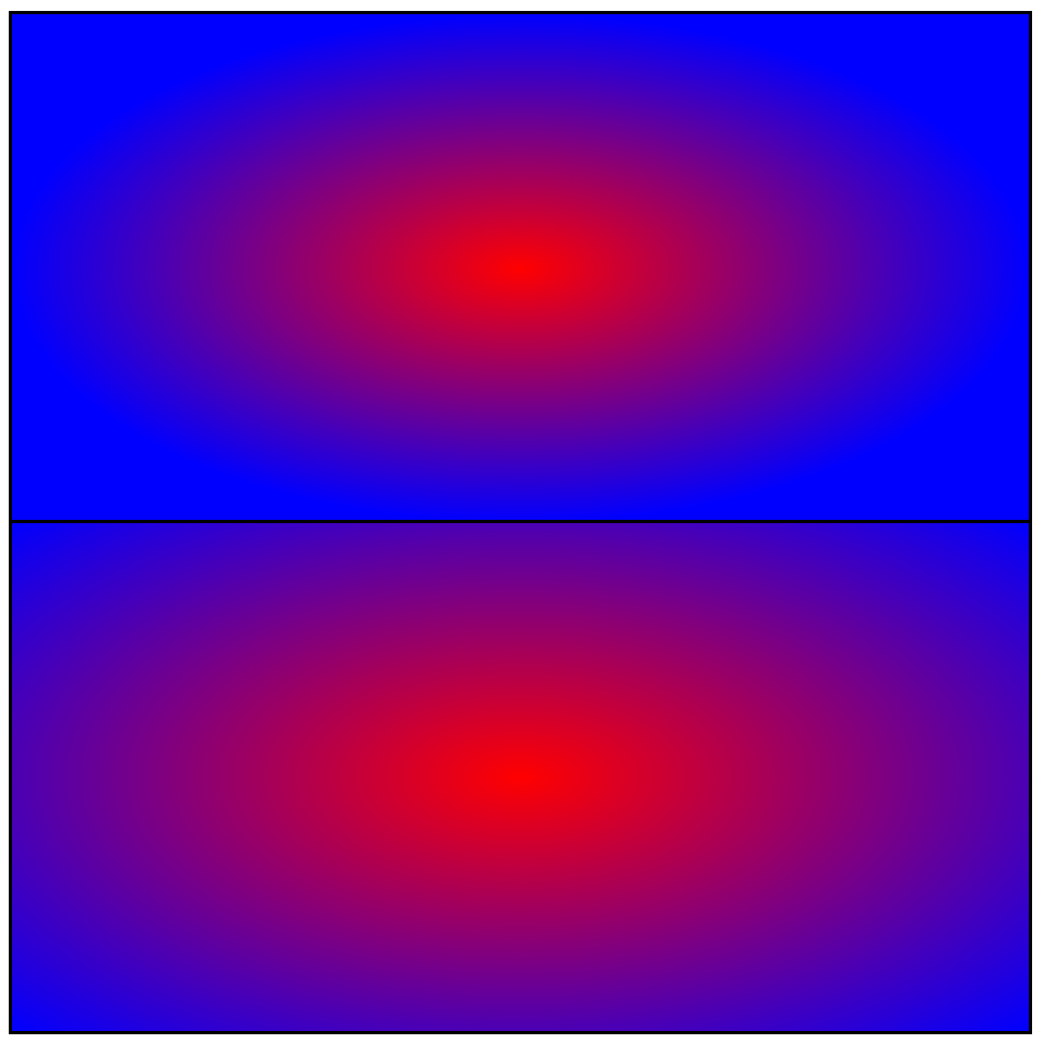
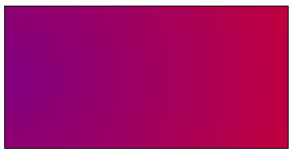
Here is a red to blue radial gradient applied to an element:
However, using the background-size property, you can set the size of the gradient box. You can also position it using background-position.
Here is the same red to blue radial gradient, but with background-size set to 50% of the width and height of the element, and background-position set to left center (oh, and no background repeat, so we can see where the gradient box is more easily):
So, the gradient box isn’t always positioned and sized like the DOM element the gradient applies to. But for the sake of simplicity, for the rest of this article, we'll assume the gradient box matches exactly the DOM element it applies to.
The center point
Because a radial gradient is either an ellipse or a circle, it has a center point.
Even if the center point is, by default, at the center of the gradient box, it can be positioned wherever you want by using the <position> parameter. That's the part that comes after the at keyword in the first argument of the radial-gradient() function.
Let's see are a few examples:
-
No
atkeyword, so, no position defined. This means the center point defaults to center:radial-gradient(fuchsia, darkblue, black, cadetblue)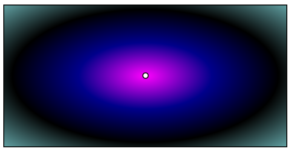
-
Position defined with keywords:
radial-gradient(at top left, fuchsia, darkblue, black, cadetblue)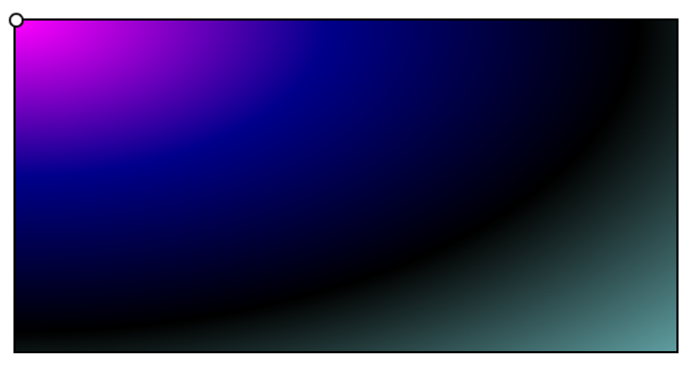
-
Position defined with absolute coordinates:
radial-gradient(at 150px 70px, fuchsia, darkblue, black, cadetblue)
As you can see, the position can be either omitted, or defined just like the background-position property: using the top, right, bottom, left keywords, or using a two lengths for the left and top offsets within the gradient box.
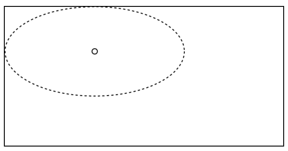
The ending shape
Now that we have a box to draw in (the gradient box), and a center point for our gradient shape, let's discuss about the ending shape.
This shape is called the ending shape because, in most cases, this is the outer-most shape that contains all of the other concentric shapes used to render the different colors of the gradient.
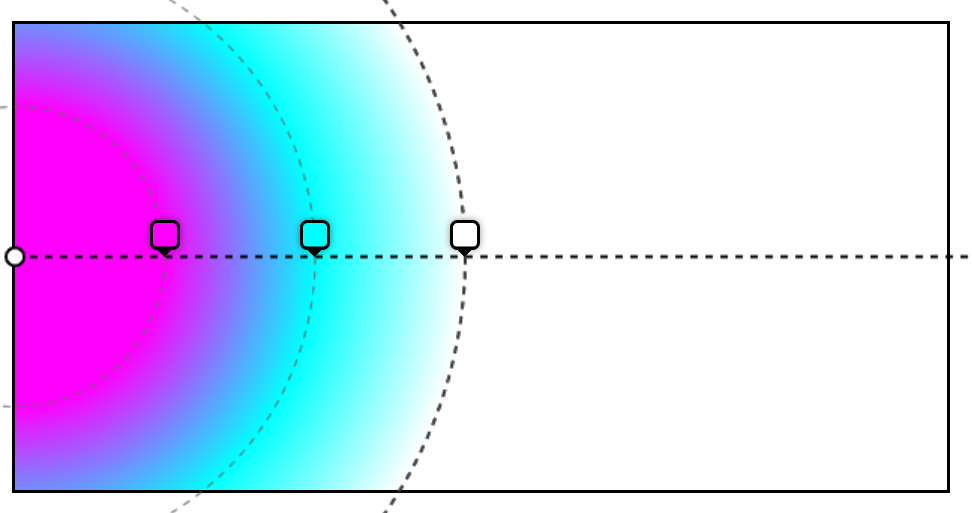
For example, consider the following gradient:
radial-gradient(circle 120px at center center, red, aqua, lime, gold, pink)
Now, let's highlight the center point, ending shape, and all color-stop concentric shapes:
The ending shape is the biggest circle, highlighted with the thicker line.
The various colors of the gradient are also circles around the same center point.
What's interesting here is that the ending shape can be defined and sized by using the <shape> and <size> parameters we saw earlier in the high-level syntax description.
- Shape: this can be either
ellipseorcircle, and defaults toellipsewhen missing. - Size: this defines the size of the ending shape, and can have the following values:
- For an ellipse, it can be two lengths, for its horizontal radius, and vertical radius.
- For a circle, it can be one length, for the radius of the circle.
- It can be one of these keywords:
closest-side,farthest-side,closest-corner,farthest-corner, which we'll explain in a minute. - If it's missing, then it defaults to
farthest-corner.
To familiarize ourselves with this syntax, here are few valid examples of radial gradients:
-
No shape (defaults to ellipse), with a
closest-sidesize:radial-gradient(closest-side, black, lime, fuchsia)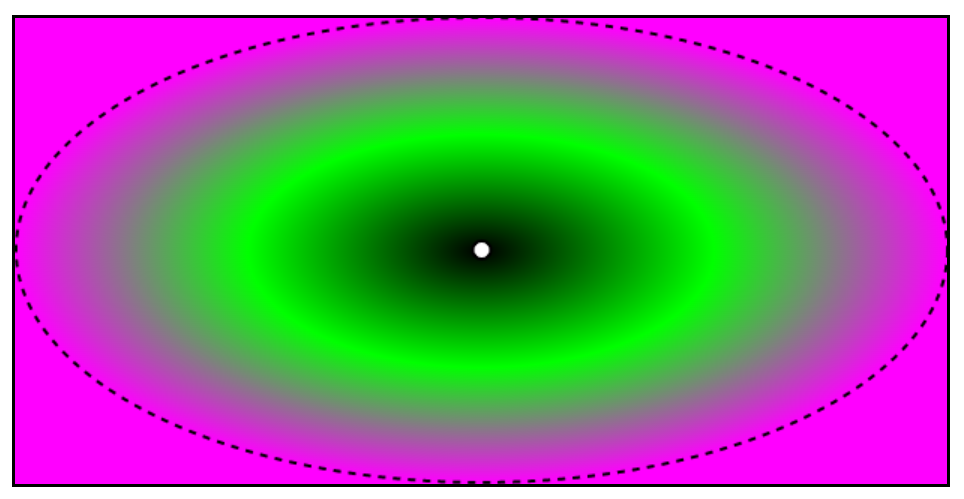
-
Circle shape, with a 100px radius:
radial-gradient(circle 100px, black, lime, fuchsia)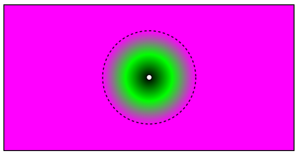
-
Ellipse, with a 200px horizontal radius, and a 50px vertical radius:
radial-gradient(200px 50px, black, lime, fuchsia)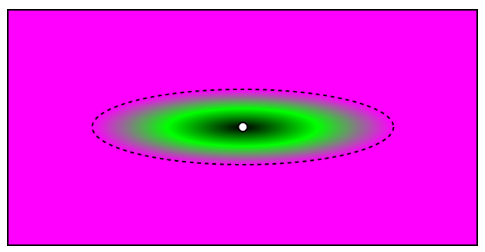
While defining a size by using lengths is rather simple, using keywords requires an explanation.
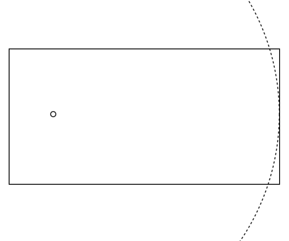
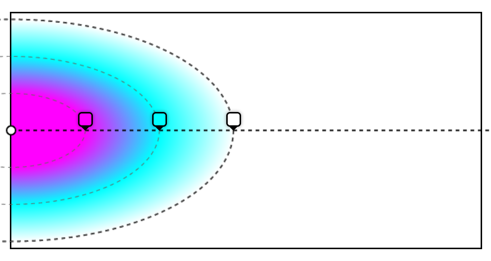
Closest-side
With this keyword, the ending shape will be sized such that it meets the closest side (or sides) of the gradient box from its center.
For a circle, that's easy, the browser rendering engine finds which, of the top, right, bottom, or left sides of the box is closest to the center point, finds out the distance, and uses this as the radius of the ending shape.
For example, if we wanted a circle positioned at 100px/150px inside the gradient box, and if we wanted it to be sized such that it met the closest side, we could use the following syntax:
radial-gradient(circle closest-side at 100px 150px, white, white)
And this would give us the following ending shape:
The left side of the box is at 100px away from the center, which is the closest from all sides, so the shape's radius is 100px.
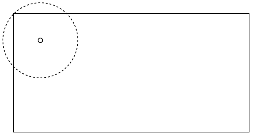
For ellipses, things are a bit more complicated, because ellipses have two radii: a horizontal radius, and vertical radius.
In this case, the ellipse's horizontal radius is sized such that the ending shape meets the left or right side, depending on which is the closest. And the ellipse's vertical radius is sized such that the shape meets the top or bottom side, depending on which is closest.
For example, let's define a gradient centered at 200px/100px within the shape:
radial-gradient(closest-side at 200px 100px, white, white)
Which gives us the following ending shape:
As you can see in the above figure, the left and top sides are the closest sides to the point, horizontally, and vertically respectively. Therefore, they are the sides that the ending shape meets with the closest-side keyword.
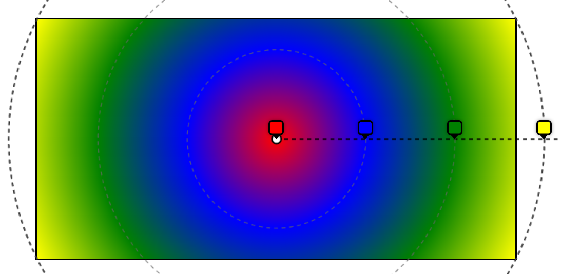
Farthest-side
Now that we know how the closest-side keyword works, it's easier to understand the farthest-side keyword.
Instead of looking for the closest side (or sides), the browser rendering engine will look for the farthest side (or sides).
Here is an example with the same circle shape as before:
radial-gradient(circle farthest-side at 100px 150px, white, white)
And the result:
As you can see, we can't even see the whole circle, because the radius is much larger than before.
Closest-corner and farthest-corner
Now, replace side with corner, and you should see how these two keywords work.
Instead of measuring the distance between the center point and the sides, the browser rendering engine now measures the distance to the closest and farthest corners of the gradient box.
For example, with the following gradient, we should end up with a circle that passes through the closest corner of the box:
radial-gradient(circle closest-corner at 70px 70px, white, white)
And we do! As you can see below, the top-left corner of the box is the closest to the shape's center, so that's where the shape passes:
Finally, consider this gradient:
radial-gradient(circle farthest-corner at 70px 70px, white, white)
The bottom-right corner of the gradient box is the farthest corner from the center point of the ending shape, and so that's where the shape passes:
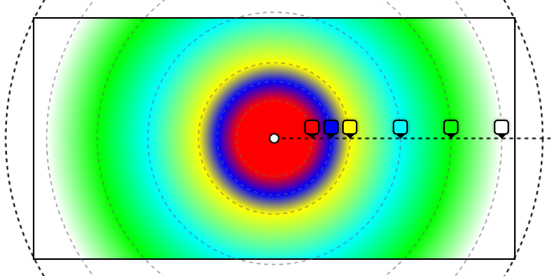
One more things about these keywords: if you don't define a size for the ending shape, it defaults to farthest-corner. But why?
Well, my understanding is that this value produces the best result in most cases, especially if the shape is positioned at the center. With farthest-corner, the last color in your gradient can be positioned exactly at the farthest visible point of the box, giving you the most room possible for your gradient to be displayed in.
Let's take the example of a red to blue gradient and compare the difference between closest-side and farthest-corner:
As you can see, in the latter case, the gradient has more room to breath. But, of course, this will depend on the effect that you're trying to achieve.
The gradient ray
The gradient ray is a half-line that starts at the center point, and extends horizontally, and to the right, as shown below:
Now, this line is, in itself, not very interesting, but it does play a role when the rendering engine of the browser distributes colors along the gradient.
Because a radial gradient can be an ellipse, it may not have the same horizontal and vertical dimensions. Think about what that entails if you wanted a gradient with the color red at 20px, then the color green at 50px. Where would the 20 and 50px be measured at?
That's where the gradient ray comes in.
The colors defined in the color stops value are placed on the gradient ray, starting at the center point, and extending infinitely to the right.
This ray is similar to the gradient line in linear gradients.
Let's take the following example:
radial-gradient(circle 300px at left center, fuchsia 100px, aqua 200px, white 300px)
The first color, fuchsia, will be positioned along the gradient ray, 100px right of the center point, aqua at 200px, and white at 300px (which happens to be the radius of the circle):
Based on this, the rendering engine just has to figure out how to draw the concentric shapes. For circles, that's going to be easy, because the radius is already known: that's the position where the color stop is.
For ellipses, the rendering engine does a bit more maths. It knows the two radii of the ending shape, it knows the center point, and it knows the horizontal radius, since that's the position of the color stop.
From this, it needs to find the vertical radius of the color stop shape.
Here is an example, similar to the last one, but using an ellipse shape:
radial-gradient(300px 150px at left center, fuchsia 100px, aqua 200px, white 300px)
And here is how the color stops will be distributed along the gradient ray, and what the concentric ellipses will look like:
Color stops
And this brings us to the last part of the radial gradient syntax: the color stops.
As a reminder, that's the part that appears after the shape, the size, and the position the following expression:
radial-gradient(<shape> <size> at <position>, <color stops>)
We've already seen a bunch of examples of color stops in this article so far, so it shouldn't be a surprise that color stops can be expressed in the following ways:
- Just a color, e.g.
red. - A color and a position, e.g.
red 100px.
But there's also a third way:
- A color, a start position, and an end position, e.g.
red 100px 200px.
When no position is defined, this means we're letting the browser decide where to put the color. It will do this by distributing it evenly along the gradient ray, depending on other colors.
When only one position is defined, then that's the place where the color should appear.
When two positions are defined, then the color should span from the start position to the end position.
Let's review a few examples next.
Auto-distribution
Consider the following gradient:
radial-gradient(circle, red, blue, green, yellow)
Here, we're not defining any position. Instead, we want the browser to auto distribute the color stops, which it will do gladly.
To do this, it will place the first color at 0% on the gradient ray (so, at the center point). Then it will place the last color where the ray meets the ending shape (that's the 100% position). And it will then distribute the rest of the colors in between those two bounds, evenly.
We'll therefore end up with:
- red at 0%.
- blue at 33.333%.
- green at 66.666%.
- yellow at 100%.
Can you guess why yellow is outside the gradient box?
Well that's because we didn't specify a size for the shape, and so it defaulted to farthest-corner, which means that the 100% position is actually slightly outside the box. But it also means that the corners are exactly yellow.
So far, auto-distribution of color stops seems quite simple, doesn't it? It gets more complicated when some of the stops have positions, and others don't. Consider the following gradient:
radial-gradient(circle, red 50px, blue, yellow 100px, aqua, lime, white 300px)
We have the following stops:
- red at 50px
- blue
- yellow at 100px
- aqua
- lime
- white at 300px
While some of the stops have positions, others don't.
In this case, the browser will take what it has, and figure out the rest.
To do this, here's a way: find ranges, from one positioned stop, to the next, and evenly distribute the non-positioned stops within the range. And continue with other ranges.
In our case, that means considering the red to yellow range (from 50 to 100px), and finding a position for blue. Because that's only one stop, put it in the center of the range, at 75px.
Then, take the yellow to white range (from 100 to 300px), and distribute aqua and lime evenly in this range (at 166.666px and 233.333px).
We end up with the following gradient:
There are even more corner cases with this, such as:
- If we have only one positioned stop.
- If the first positioned stop has a negative position.
- If the last positioned stop has a position greater than 100%.
Let's not spend more time on this though. Hopefully, this is enough to understand how auto-distribution works.
Play around with this, and let the browser figure out the final distribution of your colors!
Hard stops
One very useful thing you can do with color stops is display colors next to each other with no transition between them.
Yes, that's a bit counter-intuitive to the whole idea of using gradients where colors are supposed to transition smoothly from one to the next, but it can lead to very interesting effects. Here are a few examples:
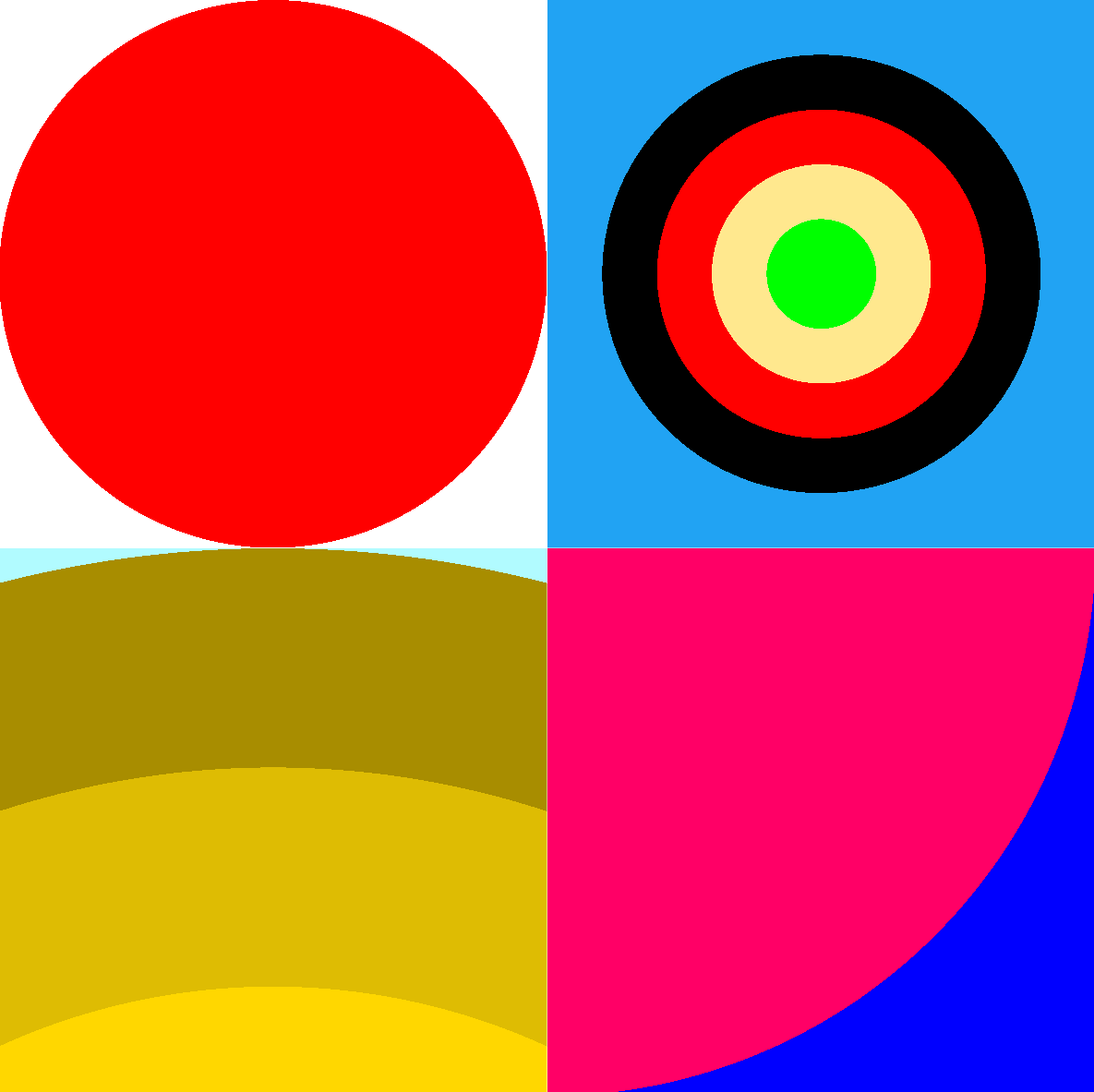
Hard stops happen when two neighbor color stops share the same position. In the top-left example in the above figure, the red circle could be done with:
radial-gradient(red 250px, white 250px)
Another way to achieve hard stops is to use ranges, like in the top-right example:
radial-gradient(lime 0 5vmin, #ffe88e 5vmin 10vmin, red 10vmin 15vmin, black 15vmin 20vmin, #21a3f3 0)
In this example, each color has two positions: a start position and an end position. And the next color starts right where the previous one ends.
Out of order positions
Of course, it would be too easy if color stops were always given in their order of appearance.
CSS is such a wonderful language that always knows how to display something, even if you screw up the code. In the case of color stops, that means you can actually provide colors in the wrong order, and the browser will still try to figure something out.
Consider the following gradient for example:
radial-gradient(rebeccapurple 250px, #000 100px, white 350px)
What would happen in this case? The browser would start at 250px, then realize the next stop is positioned at 100px, which is wrong. Stops are supposed to be given in increasing positions. So, here, the browser would just auto-correct the position and set it to the same position as the previous stop: 250px. Then it would continue to black, positioned at 300px.
We would end up with the following gradient:
This error-correction browser mechanism can actually come in handy. Say you want to draw circles as the background of an element, but you want the outside of those circles to be transparent so that other circles are visible too.
You can set the last stop of each radial gradient to transparent 0. The browser will correct 0 to be the same as the previous stop, therefore creating a hard limit at the edge of your shape, like this:
The above figure was created by using 5 different radial gradients on the same element, each with two color stops, one with the color of the circle, and the other one being transparent 0. Here is the full code:
.bubbles {
  background-image:
    radial-gradient(circle 100px, #783d54 100%, transparent 0),
    radial-gradient(circle 200px at top left, #4a2030 100%, transparent 0),
    radial-gradient(circle 50px at 100px 250px, #dd206b 100%, transparent 0),
    radial-gradient(circle 70px at 500px 250px, #f06 100%, transparent 0),
    radial-gradient(circle 140px at 120px 500px, #d5a6b9 100%, transparent 0);
}
Out of range positions
The final color stops example I wanted to give is out of range positions. So far, we've seen color stop positions between 0 and 100% of the gradient ray. But, nothing prevents us from setting positions outside this range.
For example, this is valid:
radial-gradient(circle at left center, blue -200%, red 200%)
This can be useful to create a much more subtle gradient. Here, because the two color stops are quite far apart, and outside the gradient box, we only see a zoomed in part of the red to blue gradient:
Browser support
Last but not least, let's take a quick look at browser support for the radial-gradient CSS function:
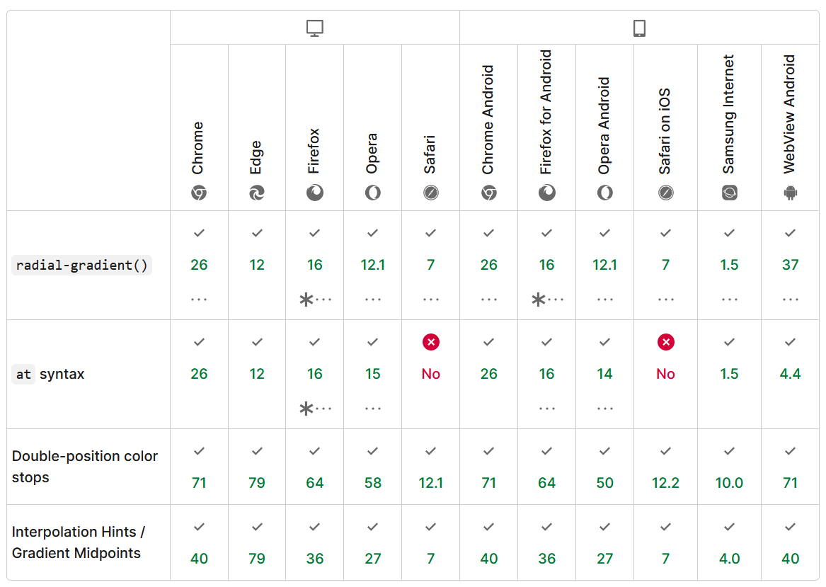
Overall, the function is very well supported across browsers, with the notable exception of the at keyword for positioning the ending shape in the gradient box in Safari.
If you really need to use this syntax on Safari, then you're only way is to use the background-position property to move the gradient to the right place.
And with this, that's it! We've seen the different parts that make a radial gradient. I hope you now understand the radial-gradient function better. I know I do. I can now more comfortably use this function and be pretty certain of the result before I even see it, which is great.
Now, before we wrap this up, let's have fun with a few quick demos that use radial gradients for interesting effects. Use DevTools to inspect the demos.
Note: this last one doesn't work on Safari, see browser support.
While these are purely decorative examples, and unlikely to be useful on real websites, CSS gradients, both radial, linear, and conic, offer a lot of flexibility when it comes to drawing details in the background of elements without having to add more elements to your document.
I hope this article helped you. Drop me a note on Twitter if you liked it!