Embrace the chaos — The shape and flow of masonry layouts
Masonry is a cool looking layout that can create visually stunning designs. It's not for every use case, that's for sure, but it has its place in a web designer's toolbox, and people have been wanting to do this for a long time.
The good news is, masonry is finally getting implemented for real in browsers, and should be usable very soon thanks to display: grid-lanes;
In this article, I want to explore how masonry relates to other types of layouts, and to do this, I'll focus on something I don't see being talked about often: shape and flow.
Shape and flow of a layout
The shape of a layout is the visual structure that it creates for its items. For example, if a layout container makes its children elements appear in columns, then the shape of that layout is column-based.
The flow of a layout is the path which items follow to appear within the layout's structure. For example, in a column-shape layout, the items might fill each column one by one, or they might fill rows first, going left to right.
When using a CSS layout on a webpage, what's more important to you? The visual shape of the layout or the way that the items flow within that shape?
Both are important, right?
- The final shape of the layout is important because that's what users see and that's what designers want.
- The flow of the items is also important because that's how users read and interact with the content.
So, ideally, any type of CSS layout should allow you to define and customize, to some extent, both of these aspects.
Layout types
Let's consider the following layout types (I'm ignoring tables, and positioning techniques like absolute/fixed in this article):
- Normal flow
- Flexbox
- Grid
And then compare this to masonry.
They all have their specific shapes and ways of handling the flow of items through the layout.
Normal flow
Normal flow is the default layout type in CSS that's used anytime you don't specify a different layout.
- Shape: the normal flow layout has no predefined shape beyond being a box, like any element on the web. A box, nothing more, nothing less. Normal flow doesn't impose any specific structure to its items.
- Flow: the way items flow through the layout depends on the items themselves, not the layout shape (which doesn't exist). Block-level items stack vertically, one after the other. Inline-level items flow horizontally, wrapping to the next line when they reach the edge of the container.
Normal flow is how the web got started, it's great for documents where different sections are stacked on top of each other, and text is the main content.

Flexbox
-
Shape: just like normal flow, flexbox doesn't have a predefined shape and doesn't impose any specific structure to its items beyond its size and rectangular shape.
At least, as long as you don't use
flex-wrap. If you do and if you have enough items, then flexbox creates multiple flex lines to place these items. This creates a structure which your items have to follow. -
Flow: the way items flow through a flexbox layout is determined by the
flex-directionproperty. If set tocolumn, items stack vertically, one after the other. If set torow, items flow horizontally.Flexbox also supports
row-reverseandcolumn-reversevalues, which changes the starting edge of the layout.

Grid
-
Shape: grid is different from the two previous layout types in that it does impose a very specific shape, or structure, to its items. Grid lets you define a two-dimensional shape by using the
grid-template-columnsandgrid-template-rowsproperties. With this, you create rows and columns of specific sizes, and items can't escape this structure. -
Flow: the way items flow through a grid layout is highly customizable.
You can either place all items in specific cells by using
grid-column,grid-row, orgrid-area.Or you can decide how the items flow through the cells by using the
grid-auto-flowproperty. When not set, the default value makes the items fill each row one by one before going down to the next row.

Masonry
-
Shape: masonry is similar to grid in that it imposes a specific shape to the items, but it's also similar to flexbox in that it only does this along one dimension. The shape is either made up of columns or rows, depending on whether you define
grid-template-columnsorgrid-template-rows. This creates lanes where items are placed, and which they can't really escape. -
Flow: the way items flow through a masonry layout is determined by the masonry algorithm.
This algorithm picks the right lane for each item based on which lane has the most space available. Because of this, you don't really get to decide how items flow through a masonry layout. It's imposed by the packing algorithm, and depends on the shape of the layout.

The masonry packing algorithm
Let's go back to the algorithm which masonry uses to place items in the layout.
This algorithm places each item one after the other, and at each step, finds the lane where the most space remains.
For example, in a vertical masonry layout that already has 19 items, the 20th item will be placed in the column where the total height of all items is the shortest. In the illustration below, that's the second column from the left:

In case of ties, the lane that's closest to the starting edge will win. In a left-to-right layout, the leftmost lane wins ties; in a right-to-left layout, the rightmost lane wins ties. You can also influence this by using the flow-tolerance property, but let's not get into that here.
It's pretty interesting to think of this algorithm as being opportunistic. In masonry, the emphasis is on optimizing to reduce empty space, rather than on controlling the order of items.
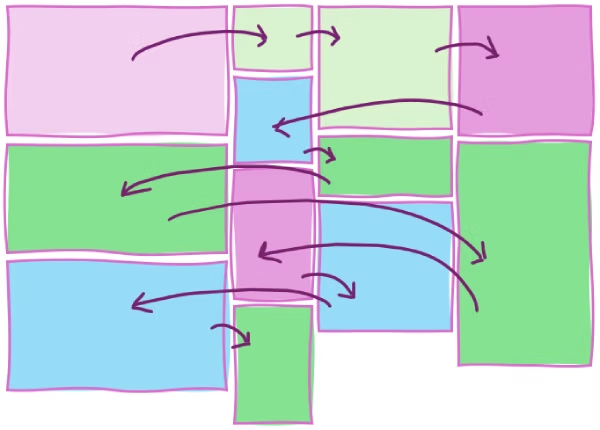
For example, it's easy to end up in situations where items which follow each other in the DOM appear far apart visually, or even in seemingly random order:

There may very well be cases, though, where items of a masonry layout logically follow each other in a natural reading sequence, especially if items are of similar sizes. But that's probably the exception rather than the norm:

Is masonry more like grid or flexbox?
Masonry is its own thing, but finding similarities with other layout types can be helpful. Indeed, masonry is still largely being defined by the CSS Working Group, and there are parts of it which are still up for debate. Resolving the remaining open questions take a deep understanding of other layout types, and existing CSS properties because reusing existing syntax and being consistent can make a big difference for developers.
So let's try to find consistency with other types of layouts.
Is masonry like grid?
Well, first of all, masonry and grid have a pretty similar display type name:
display: grid;display: grid-lanes
But they're also similar in that you define the shape of both layouts by using grid-template-columns or grid-template-rows. You can also place items in specific lanes of a masonry layout by using grid-column and grid-row, just like you can use these properties to place items in specific cells in a grid layout.
It also kind of looks like a grid, at least sometimes, and if most of your items are about the same size. If items are of very distinct sizes however, the grid-like appearance quickly breaks down:

However, unlike grid, masonry doesn't have a notion of cells. You can't place items in specific cells, only in specific lanes. And when you do, the items are placed at the end of that lane, following other items that might already be there.
Also, as we've seen before with masonry, you don't get to decide how items flow through the layout. The flow is always determined by the packing algorithm, which places items in the shortest lane available at each step.
But anyway, let's entertain the idea that masonry is similar to grid.
In a grid, you describe the shape of the layout by using grid-template-columns and grid-template-rows. If you want two columns and ten rows, you use grid-template-columns: repeat(2, 1fr); grid-template-rows: repeat(10, auto);
This defines the scaffold of the shape you want to see. You get to define it explicitly, with keywords that make sense: columns and rows.
And then, you can change the flow of the items within that shape as we've seen before, either by positioning items explicitely by using grid-column and grid-row, or, by using the grid-auto-flow property:
In grid, flow and shape are independent, and you get to define both separately. That's because the grid-template-* properties completely describe the shape of the layout, and the grid-auto-flow property only describes the flow.
Masonry is kind of like that but different. For starters, you only define one dimension of the shape, not two. So you either use grid-template-columns or grid-template-rows, but not both. And once the lanes are defined, you don't get to change the flow of the items because it's determined by the masonry packing algorithm.
The only aspect of the flow you can change is the starting edge of the layout: which lane gets filled first in case of ties.
So is masonry more like flexbox then?
Flexbox and masonry share quite a few similarities:
- They're both one-dimensional layouts meaning that you only define one dimension of the layout shape, not two.
- You don't get to define the flow of items beyond the starting edge and the direction of the layout.
In flexbox, you use the flex-direction property to define both the shape of the layout and the starting edge. For example, row creates a horizontal row of items that start from the left edge of the layout container (in western left-to-right languages), and row-reverse creates the same shape but starts placing items from the right edge instead.
The flex-direction property also supports the row-reverse and column-reverse values, letting you change the starting edge of the layout.
Finally, flexbox also supports the flex-wrap property which lets you reverse the wrapping direction for multi-line flex containers, which in a way is also a way to set the starting edge of the layout.
So with flexbox, you get to define the shape of the layout only (row, column, wrapping) and the edges from which items start to be placed. But, you don't get to define the flow of the items beyond that.
Masonry is kind of similar to flexbox in that you only get to define one dimension of the layout. The layout is either made up of columns or rows.
And then, you can decide which of the edges should the items start to be placed from. But you don't get to choose how they actually stack up beyond that. The packing algorithm always determines the flow of items.
This makes flexbox and masonry pretty similar in my opinion. Does that mean that masonry should be made consistent with flexbox and therefore support grid-lanes-direction and grid-lanes-wrap?
Overall though, masonry is its own thing
Overall though, masonry is its own thing. It shares a few aspects of both grid and flexbox, but it also has some unique characteristics.
Masonry kind of feels chaotic, both from a developer's and a user's perspective.
-
From a developer's perspective:
It's hard to control the reading order of items, because the packing algorithm is opportunistic and depends on the sizes of the items already placed in the layout.
If you have very precise control over the number of lanes and the exact size of your items, perhaps you might be able to customize the reading order to what you want. But in that case, wouldn't you be using a CSS grid instead?
The whole point of masonry is that it's easy to use for cases where you don't really care about the order of the items.
-
And from a user's perspective:
It's also hard to know in which order to read items. An English reader might try to start from the top left and go right, then down. But because of the way items are packed, there might not always be a clear path to follow, and the user might have to jump around the layout to find the next item.
That's why masonry is usually best for image galleries, portfolios, and other cases where the visual arrangement is more important than the reading order.
As a developer, you don't really control the flow, just the direction of packing. And as a user you don't really see the flow either, it looks chaotic and you don't know which order to scan items in. There's no clear reading order. So why trying to set one?
Embrace the chaos!