Understanding CSS subgrid
Features of the web platform tend to move very slowly. It can take years for them to mature from an idea, to a prototype, to a specification, and to a final implementation in all the major browsers.
The CSS Subgrid feature is no exception. The very first browser to ever implement subgrid was Firefox, in 2019. And the specification had been around for at least two years before that.
The feature only became available across all three major browser engines (Gecko, Webkit, and Blink) at the end of 2023, more specifically in September 2023 with the release of Chrome and Edge 117.
Yes, you can use CSS Subgrid in Chrome, Edge, Safari, and Firefox now. Keep in mind, though, that all of your users might not yet be using the latest versions of those browsers (or browser engines), check your site's usage carefully.
So what is CSS Subgrid, and when and how to use it?
Quick reminder about CSS grid
Before we dive into subgrid, let's quickly remind ourselves of what CSS grid is.
CSS grid is a layout system that allows you to create complex two-dimensional layouts. You can define rows and columns, and place items in cells. The grid itself is only defined in CSS. There are no HTML elements that represent the the grid's columns or rows. You don't even need to have HTML elements for the cells. CSS grid lets you define the layout purely in CSS, and use HTML for the content only.
Here is some HTML code that defines a container element with a few children:
<div class="notebook-pages">
  <div class="page"></div>
  <div class="page"></div>
  <div class="page"></div>
  <div class="page"></div>
  <div class="page"></div>
</div>
You can use CSS grid to define a grid in the .notebook-pages container, which automatically places the .page child elements into grid cells. The snippet below shows one way to do this with CSS grid:
.notebook-pages {
  /* Turn the container element into a grid. */
  display: grid;

  /*
  Define columns by using the repeat() syntax.
  The grid container will have a variable number of columns,
  depending on the space available. Columns will at least be
  200px wide, but can grow to fill the available space.
  */
  grid-template-columns: repeat(auto-fill, minmax(200px, 1fr));

  /* Add some gap between rows and columns. */
  gap: 0.5rem;
}
And here is the result. Try resizing the browser window to see how the grid adapts to the available space:
I won't go into more details about CSS grid here. To learn more about it, check out CSS grid layout at MDN.
The problem with nested elements
As shown in the previous example, the elements that are positioned in the grid are direct children of the grid container. In the example, these were the .page elements. While this is very convenient, and sufficient in many cases, it can also be limiting.
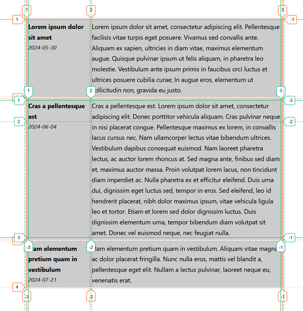
Consider the following example: you have a list of articles, and each article has a title, a publication date, and some text. You want to display these articles in a grid, with each article taking up a row in the grid, and where each row has two columns: one for the article's title and date, and one for the article's text, as shown below:
Lorem ipsum dolor sit amet
2024-05-30
Lorem ipsum dolor sit amet, consectetur adipiscing elit. Pellentesque facilisis vitae turpis eget posuere. Vivamus sed convallis ante. Aliquam ex sapien, ultricies in diam vitae, maximus elementum augue. Quisque pulvinar ipsum ut felis aliquam, in pharetra leo molestie. Vestibulum ante ipsum primis in faucibus orci luctus et ultrices posuere cubilia curae; In augue eros, elementum ut sollicitudin non, gravida eu justo.
Cras a pellentesque est
2024-06-04
Cras a pellentesque est. Lorem ipsum dolor sit amet, consectetur adipiscing elit. Donec porttitor vehicula aliquam. Cras pulvinar neque in nisi placerat congue. Pellentesque maximus ex lorem, in convallis lacus cursus nec. Nam ullamcorper lectus vitae bibendum ultrices. Vestibulum dapibus consequat euismod. Nam laoreet pharetra lectus, ac auctor lorem rhoncus at. Sed magna ante, finibus sed diam et, maximus auctor massa. Proin volutpat lorem lacus, non tincidunt diam imperdiet ac. Nulla pharetra ex et efficitur eleifend. Duis urna dui, dignissim eget luctus sed, tempor in eros. Sed eleifend, leo id hendrerit placerat, nibh dolor maximus ipsum, vitae vehicula ligula leo et tortor. Etiam et lorem sed dolor dignissim luctus. Duis dignissim elementum urna, tempor bibendum diam volutpat sit amet. Donec vel euismod neque, nec feugiat nulla.
Nam elementum pretium quam in vestibulum
2024-07-21
Nam elementum pretium quam in vestibulum. Aliquam vitae magna ac dolor placerat fringilla. Nunc nulla eros, mattis vel blandit a, pellentesque eget elit. Nullam a lectus pulvinar, laoreet neque eu, venenatis erat.
Let's say each article comes from a CMS, and is represented by a div element with the class .article. This extra article parent element is useful for styling the article as a whole, but it's not necessary for the layout. In fact, it's even annoying because it means you can't define your grid layout on the parent element which contains the list of articles. That's because CSS grid only allows you to place direct children of the grid container into grid cells.
Here are some ways around this limitation:
- Define a grid layout on each
.articleelement individually. However, this might make it hard to align the articles in a consistent way across rows of the parent grid. - Apply
display:contentsto each.articleelement, which makes the.articleelement disappear from the rendered page, and its children take its place in the grid. However, this technique is known to have accessibility issues: the element itself will no longer be presented by assistive technologies.
Enter CSS Subgrid
CSS Subgrid is a solution to this problem. CSS Subgrid allows you to create nested grids that inherit their parent grid's rows and columns definitions. Here is how you can use CSS Subgrid to solve the above problem with the articles list:
First, define the grid layout on the parent element, .articles-list, even if its direct children are not the elements you want to place in the grid:
.articles-list {
  display: grid;
  grid-template-columns: 1fr 3fr;
}
In the above code sample, the .articles-list element is a grid container with two columns. The first column will be used for the article's title and date, and the second column for the article's text.
Now, you can define a subgrid on the .article elements, which will inherit the columns of the parent grid:
.articles-list .article {
  grid-column: span 2;
  display: grid;
  grid-template-columns: subgrid;
  grid-template-rows: min-content 1fr;
}
As you can see from the code sample above, each .article element spans the two columns of the parent grid. So it doesn't use these columns at all. Instead, it defines itself as a grid too (with display: grid) and uses grid-template-column: subgrid to inherit the columns of the parent grid. This is the key part of CSS Subgrid, the ability to refer to the parent grid's column or row templates, by using the subgrid value.
The code sample also defines grid-template-rows: min-content 1fr to create two rows in the .article grid. The first row will be used for the title, and the second row for the date. The text of the article will span both rows, and will be displayed in the second column of the parent grid.
Here is the complete code sample for the layout example from before:
<style>
.articles-list {
  font-size: .9rem;
  display: grid;
  grid-template-columns: 1fr 3fr;
  gap: 0.25rem;
  padding: 0.25rem;
}
.articles-list .article {
  grid-column: span 2;
  display: grid;
  grid-template-columns: subgrid;
  grid-template-rows: min-content 1fr;
  padding: 0.25rem;
}
.articles-list p {
  margin: 0;
}
.articles-list .title {
  font-weight: bold;
  grid-column: 1;
  grid-row: 1;
}
.articles-list .date {
  font-style: italic;
  grid-column: 1;
  grid-row: 2;
  font-size: .8rem;
}
.articles-list .text {
  grid-column: 2;
  grid-row: 1 / span 2;
}
</style>
<div class="articles-list">
  <div class="article">
    <p class="title">Lorem ipsum dolor sit amet</p>
    <p class="date">2024-05-30</p>
    <p class="text">Lorem ipsum dolor sit amet, consectetur adipiscing elit. Pellentesque facilisis vitae turpis eget posuere. Vivamus sed convallis ante. Aliquam ex sapien, ultricies in diam vitae, maximus elementum augue. Quisque pulvinar ipsum ut felis aliquam, in pharetra leo molestie. Vestibulum ante ipsum primis in faucibus orci luctus et ultrices posuere cubilia curae; In augue eros, elementum ut sollicitudin non, gravida eu justo.</p>
  </div>
  <div class="article">
    <p class="title">Cras a pellentesque est</p>
    <p class="date">2024-06-04</p>
    <p class="text">Cras a pellentesque est. Lorem ipsum dolor sit amet, consectetur adipiscing elit. Donec porttitor vehicula aliquam. Cras pulvinar neque in nisi placerat congue. Pellentesque maximus ex lorem, in convallis lacus cursus nec. Nam ullamcorper lectus vitae bibendum ultrices. Vestibulum dapibus consequat euismod. Nam laoreet pharetra lectus, ac auctor lorem rhoncus at. Sed magna ante, finibus sed diam et, maximus auctor massa. Proin volutpat lorem lacus, non tincidunt diam imperdiet ac. Nulla pharetra ex et efficitur eleifend. Duis urna dui, dignissim eget luctus sed, tempor in eros. Sed eleifend, leo id hendrerit placerat, nibh dolor maximus ipsum, vitae vehicula ligula leo et tortor. Etiam et lorem sed dolor dignissim luctus. Duis dignissim elementum urna, tempor bibendum diam volutpat sit amet. Donec vel euismod neque, nec feugiat nulla.</p>
  </div>
  <div class="article">
    <p class="title">Nam elementum pretium quam in vestibulum</p>
    <p class="date">2024-07-21</p>
    <p class="text">Nam elementum pretium quam in vestibulum. Aliquam vitae magna ac dolor placerat fringilla. Nunc nulla eros, mattis vel blandit a, pellentesque eget elit. Nullam a lectus pulvinar, laoreet neque eu, venenatis erat.</p>
  </div>
</div>
Conclusion
In this article, we used the subgrid value for the grid-template-columns property, but it can also be used for the grid-template-rows property. In fact, you can even use subgrid for both columns and rows properties at the same time.
Note that the parent grid's gaps are also inherited by the children subgrids, but you can override them by setting the gap property on the child grid if you want to.
And that's it, thanks for reading this short article. If you remember one thing here, remember that CSS Subgrid is now available across all three major browser engines. So, if you find yourself needing it, then double-check your usage stats to make sure your users have those latest versions at least, and then go ahead and use it!