Demystifying CSS alignment
Aligning things in CSS has been a common source of frustration, fun and even memes for a long time. However CSS evolves quickly and new specifications are written and implemented in browsers all the time. As a result, aligning things in CSS today isn’t quite what it used to be. We now have to take more modern ways to do CSS layout into account, like Flexbox and Grid among other things.
In this post, I’d like to talk about alignment a little bit. What it means in Flexbox and Grid and how to think about it more generally too, so you can be equipped for the future, when aligning in Blocks, Multi-Columns, Tables, Grids and Flexbox all works the same.
Note: if you’ve read this already and all you want is a quick access to my cheatsheet, click here.
The context
The context here is essentially the W3C specification called CSS Box Alignment. And within that spec, the justify-content, justify-items, justify-self and align-content, align-items, align-self properties.
I’ve been reading this spec over the past few days, and I thought I’d write about it. (On that note, reading specs and trying to explain them to people is a really good exercise you can try if you want to make sense of CSS and really understand what's going on rather than trying stuff out until they work).
Justify or align?
You probably have come across these names if you have used Flexbox before. Indeed, they are the first part of CSS property names like justify-content and align-items.
If you’re like me, you’ve visited css-tricks’ Flexbox guide many times and now remember things like justify-content:center; align-items:center; by heart because they do cool things (like, in that case, center elements).
But you might not know which direction justify and align apply in.
Two directions
First, let’s learn about the two directions of a web page. You should keep it in your mind that there are two, perpendicular, axes on your page, and that content runs along them (I'm ignoring the Z axis here which z-index can be used for).
Reading Jen Simmons’ Writing-Modes article on that topic will help you a lot.
- One of the axes is the inline axis, it's the one each line of text runs on. By default on a web page, if you don't specify any writing-mode, this axis is horizontal, from left to right.
- The other one is the block axis and it’s the one along which blocks are stacked. Again, by default, this axis is vertical, from top to bottom.

Remembering which direction is justify and which is align
If at any point in your life you’ve used a text processing application (like Microsoft Word), you are already equipped to remember this.
Indeed, these applications almost always have a button to justify text on a line. What it does is distribute words along a line. Therefore, justify works along the inline axis. That's the trick I now use to remember this (thank you Chen Hui Jing for explaining it this way to me a few weeks ago).
And by a very elaborate process of elimination, align works along the block axis.
So, if you know which way is inline, and which way is block, then you know where justify and align apply.

(Note: if you use flex-direction:column in a Flexbox container, then this isn’t true anymore, the inline and block still point in the same direction they did before, but align and justify now don’t work along these directions. But for the sake of simplicity in this article, let’s ignore this for now).
Content, self or items?
Now we've only looked at the justify and align parts of the CSS properties that interest us here. Let's look at the rest of these property names.
Taking the justify-content:center; align-items:center; example again, you now know which direction justify and align correspond to, but you might be confused as to why one property ends with content and the other with items.
To explain why that is, we need to first understand a general concept about alignment.
Containers and subjects
This is a generic way of thinking about alignment that will apply to any layout where these properties can be used. It's very useful to understand this without necessarily only thinking about Flexbox. This way you gain a better understanding of how things are defined holistically and you can apply this knowledge to other layouts in the future.
- A container is a rectangle within which a subject is being aligned.
- And a subject is the thing (or things) that is (are) being aligned within the container.
Pretty simple, right? Now, how do these correspond to content, items and self?
Content
When you see content in the property name, then that means this property applies to an alignment container. It defines how subjects are aligned or distributed within this container.
The spec calls this content distribution.
So, in a way, it's a bit like setting the padding on an element. It applies to the element itself and ends up aligning the content within this element.
Self
If, instead you see self in the property name, then that means it applies to a subject instead. It defines how this particular subject is aligned within its container.
The spec calls this self-alignment.
In a way, you can think of it as margin, because it applies to an element but aligns it within its container.
Items
And finally, the properties ending with the items word are a special case. They apply to containers like content does, but doesn't impact them at all. Instead, this is a way to set the default value of self for all subjects within a container in one go.
So, this is self-alignment too, but the property just goes on the container instead of the subject, and sets the default self-alignment of all the subjects inside this container.
Example
So far, this has been a lot of theory and may be hard to reason about. So let's look at one example, and then in the next section we'll dive into more details with different types of CSS layouts.
Let's go back one more time to our common Flexbox centering example:
justify-content:center; align-items:center;
What you learned so far should make it possible for you to make sense of these two CSS declarations now. Let's decompose them below:
justify-content:center;
contentmeans content distribution. This applies to a container which, in the case of Flexbox would be the Flexbox element container itself (e.g. the<div>withdisplay:flex),justifyworks along the inline axis (so, horizontally by default),- finally the value is
center.
So, as a conclusion, this piece of CSS means we're centering content within this Flexbox container along the inline axis. In this case, the content we're centering is the various Flexbox items themselves.
This is defined in the spec and we'll look at it in the next section. For each axis and for each layout type, the spec tells us what is the alignment container and what are the alignment subjects. Here, the subjects are the Flexbox items.

align-items:center;
itemsmeans self-alignment, right? But if you remember from before, it is a special part of the property that really applies to subjects, even if it is set on the container,alignworks along the block axis (vertically by default),- and the alignment value is
center.
As a conclusion, this piece of CSS means set the default self alignment of all items inside this container to be centered along the block axis
Now, you might be thinking align-content:center; should do the same as align-items:center; right? I thought that too, but reading the spec provided a reason for why that is not the case in this simple example.
It comes down to knowing what is the alignment container and subject you are currently dealing with. And that's exactly what I'll be focusing on in the next section.
Flexbox alignment
Let's start with Flexbox since we've talked about it already. We'll go over the 2 types of alignment: content distribution and self-alignment.
Content distribution (justify/align-content)
Along the inline axis (justify-content), things are quite simple.
The alignment container is the Flexbox container. And alignment subjects are the Flexbox items.
So, justify-content can be used on the Flexbox container to align its items along its inline axis, as shown below:

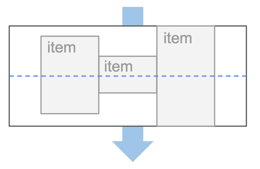
Along the block axis (align-content), things get a bit more complicated.
In this case, the alignment container is still the Flexbox container, but the alignment subject is something called the Flexbox line. Let’s explain this a bit:
In a lot of cases, Flexbox is used with all items being on just one line.
But sometimes wrapping happens, and in those cases it’s important to realise that items on each lines are wrapped into a Flexbox line.
This is a thing that contains items, is as tall (or wide) as the tallest (or widest) of them, and that can be aligned within the container.
So, in the case of align-content, we’re aligning Flexbox lines within a Flexbox container as shown below:

This explains why align-content doesn't work in the case where a Flexbox container only has one line. When it does, that line has the same size as the container, so aligning it anywhere has no visible effect.
Self-alignment (justify/align-self)
In Flexbox, self-alignment can only be used on the block axis. Indeed, justify-self can't be used to align one item, because there might be other items on the same line.
Along the block axis however, align-self can be used to align a given item. In this case, the alignment container is the Flexbox line that the item current is in, and the alignment subject is the item itself.

Grid alignment
Content distribution (justify/align-content)
Content distribution, if you remember correctly, is a thing you do on a container to distribute/align subjects within itself.
Well, in the case of content distribution in a Grid layout, the container is the Grid container itself (the element with display:grid on), and subjects are tracks (the columns and rows).
In this case we're controlling where space goes between rows or columns, just like grid gaps would.
So, justify-content controls the space along the inline axis, between column tracks, and align-content controls the space along the block axis, between row tracks, as illustrated below:

Note that content distribution might not always be possible in a grid. For instance, if the rows are defined in a way that they cover the whole grid height, then there is no space in between those rows to be distributed.
For instance, grid-template-rows: repeat(2, 1fr); will make the 2 rows take an equal share of the available height, until no space is left.
Self-alignment (justify/align-self)
Self-alignment, on the other hand, is the act of determining where inside a container a given subject is aligned.
In the case of CSS Grids, subjects are Grid items themselves (the children of the display:grid container), and containers are defined as grid areas.
What that means depends on where the item currently is. If the item is positioned in a grid cell, then that grid cell is the alignment container. If the item is placed in a grid area, then that grid area is the alignment container.
This works the same on both axis, so justify-self and align-self are easy to reason about in a CSS Grid: it simply allows you to align an item within its cell or area along both axis, like illustrated below:

Multi-column alignment
If you don't know what CSS multi-column is or haven't used it yet, I recommended heading over to the "Using Multi-column layouts" MDN page for more information.
Essentially, it's a set of CSS properties that together allow to break a block layout into several columns so that text (and other sub elements) can flow through them like newspaper or magazine articles often do.
Although I'm not aware of browsers out there supporting the justify/align-content/self/items properties in multi-column layout yet, the spec defines these properties for this type of layout too.
As I said earlier, it's useful to think of these properties globally across all sorts of layouts, because it makes it easier to reason about them. And at some stage in the future, these alignment properties will start to work for multi-column layouts too.
Content distribution (justify/align-content)
When distributing content in a multi-col layout, the alignment container is the block element that has the columns, and subjects are the columns themselves.
Along the inline axis (justify-content), what happens is a bit similar to Grid layout. The property controls spacing between columns (just like it controls spacing between column tracks in a Grid layout).

Along the block axis (align-content), the alignment container and subject are the same than before.
The property becomes useful when not all columns have the same height. Indeed, there may not be enough content to fill up all columns to the same height. So align-content can be used to align the column boxes inside the column container along the block axis like so:

Self-alignment (justify/align-self)
Self-alignment doesn't apply to multi-column layouts.
Indeed, self-alignment is something that applies to alignment subjects, where those subjects are actual elements in the page that justify/align-self can be applied on. There's nothing like this in a multi-column layout. The column boxes themselves can't be styled with these properties individually.
Block alignment
So far we've talked about rather advanced layout types, but the spec also defines how alignment works in simple blocks (really just any element with display:block; on it).
Note that there's no browsers out there that allow block alignment this way yet. But implementations will come at some stage.
Content distribution (justify/align-content)
With this type of layout, the alignment container is the block element itself, and the alignment subject is the entire content of the block, as one unit.
It's very easy to think of this as setting the padding on the block element. Except here, we're using the align-content property instead, in the same consistent way we've done it with other layout types too.

The spec however says that justify-content doesn’t work in this case.
Self-alignment (justify/align-self)
Along the inline axis (justify-self), self-alignment happens between the subject: a block, and its container: another block.
Like before, this is very similar to setting the margin on the subject:

Along the block axis however (align-self), this has no effect. Indeed, there can be more than one block along this axis, and it is therefore not possible to align one differently than the others.
Conclusion
Well, there we go, I hope this was a useful and not too boring read.
I really hope I accomplished my goal of making it easier for you to reason about these various CSS properties. I know writing this article and reading the spec really did it for me, I can now center, distribute and align things in Grid and Flexbox very easily without trying random things until it works. Now, my code works the first time.
I created a cheatsheet that contains all of the diagrams above in a small and more easily usable format. So go check it out!
Thanks for reading. Bye for now.