CSS Grid + CSS Multi-Columns = ♥
In this short article, I am exploring the relationship between two CSS layout features: CSS Grid and CSS Multi-Columns.
These two features can be used together in very interesting ways for building responsive web designs.
Let’s start by reviewing what each of those features do.
CSS columns
CSS has had the ability to organize content into columns for a while now and support is really good all across the board (apart from the need to use vendor prefixes still).
The main use case for CSS columns is to break long sections of text into several columns in order to avoid lines from being too long and therefore hard too read.
The great thing about CSS columns is that the columns are defined with CSS only, and they don’t require any additional markup. Content just flows from one column to the next naturally and automatically depending on the currently available width.
For instance, you can define a really simple multi-column layout by using the CSS property column-width: 150px; and the browser will just add as many columns as it needs to fill the available space:

CSS Grids
CSS Grids is this awesome new CSS layout system that allows web authors to organize items on a 2D grid very easily.
If you haven’t heard about it at some point during this past year, you have probably been living under a rock. The sheer amount of articles, documentation, videos and talks has ben phenomenal, and it’s been really hard to miss.
Check out Jen Simmons’ website, Rachel Andrew’s website, or Mozilla’s Grid Playground to learn all about grids.
Columns + Grids = ♥
Let’s start by creating a simple grid layout that positions a series of labels and their input fields next to each other, in 2 columns:
<style>
.grid {
  display: grid;
  grid-template-columns: 1fr 1fr;
  grid-auto-rows: 2em;
  grid-gap: .5em;
}
</style>
<div class="grid">
  <label>label</label>
  <input type="text">
  <label>label</label>
  <input type="text">
  <label>label</label>
  <input type="text">
  ...
</div>
The CSS above creates 2 equally sized columns which all of the items are going to flow through as shown below:

Now, here comes the interesting part: you can actually put a grid in a column layout! And it’s pretty amazing.
Basically, grid supports fragmentation, which means that a grid will also flow into a multiple columns layout. It will become fragmented as needed, with one fragment per column. These fragments are just parts of the same grid.
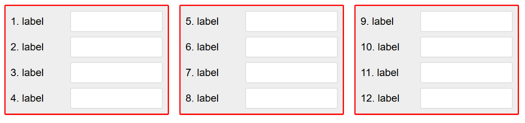
So, with the simple grid-based form example from before, let’s see what happens if we put it inside a multi-column layout with column-width: 150px:

See how, as space becomes available, the grid gets fragmented to occupy the available columns.
Here’s what the entire code could look like:
<style>
.columns {
  column-width: 200px;
  max-width: 800px;
  margin: 0 auto;
}
.grid {
  display: grid;
  grid-template-columns: 1fr 1fr;
  grid-auto-rows: 2em;
  grid-gap: .5em;
}
</style>
<div class="grid">
  <label>label</label>
  <input type="text">
  <label>label</label>
  <input type="text">
  <label>label</label>
  <input type="text">
  ...
</div>
One of the nice things about this is all the content is in the same grid, even when the grid is broken down into multiple fragments. So, the size of the grid columns, for instance, will always be the same across fragments.
Fragmenting padding and border too
If you wanted, for some reason, to add some borders and padding to the grid itself, then something like this would happen:

Indeed, the element the grid is applied to is being fragmented into the multi-column container, but there’s still only one top and one bottom sides to it. So the bottom-border only applies to the bottom side of the grid element for example.
Obviously that doesn’t look so good. Fortunately, CSS provides a way to solve this too: box-decoration-break. This CSS property can be used to define how things like background, borders, margins and paddings work in fragmentation cases (or in cases like an inline element wrapping on several lines of text).
Using box-decoration-break: clone; we get the effect we want:
That’s it! You can play with the complete example here on codepen, it also includes some fun little CSS counters which I used to number the labels via CSS only.
Happy coding, bye for now.