Do you really understand CSS linear-gradients?
Want a nice gradient background on your site?
background-image: linear-gradient(red, blue);BOOM, done!
Ok, it’s a little boring. So if you want more, I recommend this css-tricks article and MDN page.
Still here? Alright, let’s go and have a look at some of the details of how linear-gradients actually work.
First of all, let’s remind ourselves of the syntax allowed in the linear-gradient function:
linear-gradient([<angle> | to <side-or-corner>]? , <color-stop-list>)The function accepts an optional first argument which determines the angle of the gradient, which can be expressed either as an angle with a unit (deg, rad, grad, turn) or as a side-or-corner keyword.
The function then accepts a list of color stops.
The gradient box
A gradient image has not dimensions, it is infinite, unlike traditional background images. What gives a visible dimension to the gradient is its gradient box i.e. the area where it is displayed.
Typically, when you apply a linear-gradient background-image to a DOM element, that area is the border-box of the element (which is the same area a background-color would be displayed, or where an image identified by a URL would).
However, if you also use the CSS property background-size and set it to, say, 200px * 200px, then the gradient box will have this size and will be positioned at the top left corner of the DOM element by default, unless you also set background-position.
So, just remember when reading through the next sections that the gradient box isn’t always positioned and sized like the DOM element the gradient applies to.
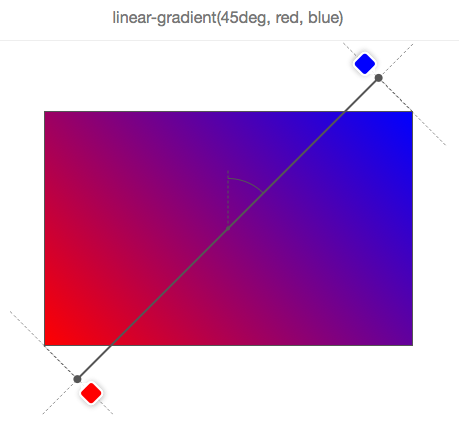
The gradient line
In the gradient box, the line that passes through the center and along which color stops are distributed is called the gradient line. This line is more easily explained when talking about the gradient angle, so more about this in the next section.
The gradient angle
Quite obviously, the angle of a linear-gradient is used to determine in which direction is the gradient going. But let’s go into more details.
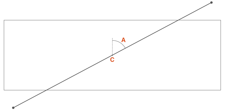
If C is the center point of the gradient box, then A is the angle between the vertical line that passes through C, and the gradient line that also passes through C and along which the gradient color stops are distributed.
You can define this angle in 2 ways:
- by using one of the keywords:
to top,to bottom,to left,to right,to top right,to top left,to bottom right,to bottom left, - or by defining the angle with a number and a unit, e.g.
45deg, 1turn, …
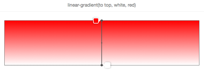
If the angle is omitted, it defaults to to bottom (which is 180deg or 0.5turn):
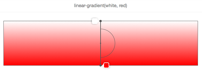
In this picture and the following ones, the gradient box is the bordered rectangle, and the gradient line is the thick grey line that passes in the center and has the color stops displayed along.
In the example above, the angle is missing, so the white-to-red gradient goes from top to bottom, which is the same as using the to bottom keyword, as shown below.
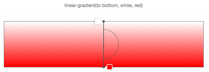
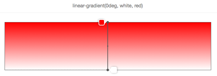
And, as shown in the following 2 pictures, to top is equivalent to an angle of zero degrees:
Another important point when using angle keywords is that to top right for example (or any of the other corner keywords) depend on the dimensions of the gradient box.
The logic is that if you wanted a red to blue gradient towards the top right corner of an element, then that element should be exactly blue at the top right corner, and the violet color in the middle of the gradient should form around a line that passes through the top left and bottom right corners.
Let’s look at this with a picture:
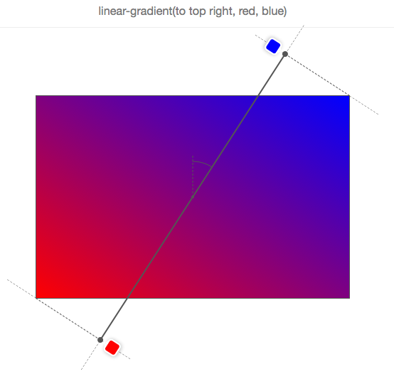
So, to top right doesn’t mean that the gradient line passes through the top-right corner and it doesn’t mean that the gradient angle is 45 degrees either!
Let’s look at how the gradient line moves when the angle changes in the following animation:
In this animation, the angle is incremented from 0 to 360 degrees, by steps of 10 degrees. The low-resolution of the GIF even allows to better see how the various colors are displayed as “lines” always perpendicular to the gradient-line.
Let’s recap on gradient angles:
- The angle is measured between the gradient line and a line that starts at the center of the gradient box and extends towards the top.
- 0 degrees therefore means
to top. - The default value for an angle, when missing, is
to bottom, which is the same than 180 degrees. - Corner keywords depend on the gradient box dimensions.
The gradient line length
Before we can take a look at how color stops are distributed along the gradient line we need to explain one thing.
You may have noticed in the previous animation that the colors stops are sometimes positioned outside of the gradient box, which may sound weird at first but is logical once you know the reason.
Consider this example:
We want a gradient from red to blue, at 45 degrees and because of the aspect ratio of the gradient box, the gradient line cannot pass through the top right corner.
But what the browser wants to do here (well, what the specification tells it to do) is make the top right corner exactly blue.
If we had made the gradient line only start and end at the edges of the box, then the color blue would have covered a greater area of the box, and the gradient wouldn’t have been spread out as much.
Therefore, in order to do this, the gradient line sometimes has to extend out of the gradient box.
It’s easy to know where it starts and ends though. Just draw a line that passes through the nearest corner and that is perpendicular to the gradient line. The point where that line crosses the gradient line is the start/end position (this is explained quite nicely in the specification).
In fact, if you let W be the width of the gradient box, H its height, and A the gradient angle, then the length of the gradient line is:
abs(W * sin(A)) + abs(H * cos(A))Color stops
Color stops are organized in a coma-separated list where each item can be defined as:
<color> [<percentage> | <length>]?It is therefore not mandatory to specify where the color should be placed on the gradient line. For instance, this is ok:
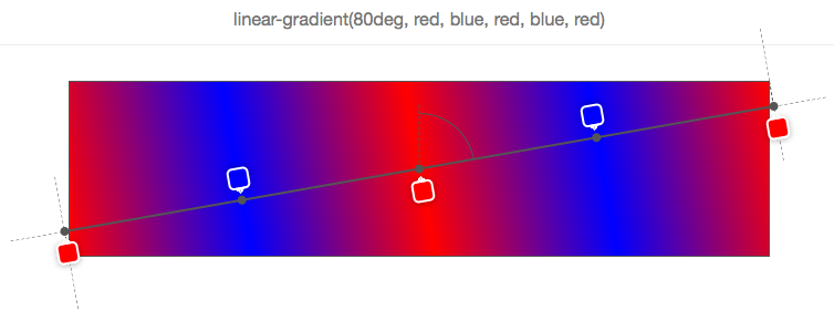
None of the color stops have positions, so the browser determine positions for them.
In the simplest case, with just 2 colors, color 1 would be placed at 0% (the start of the gradient line), and color 2 at 100% (the end of the gradient line).
Then if you add a third color, you’d have color 1 still at 0%, color 2 at 50% and color 3 at 100%, and so on.
In the example above, 5 color stops have been defined, and the browser has calculated their respective positions as 0%, 25%, 50%, 75%, 100%. The reason it does this is to distribute the colors evenly along the gradient box.
Now, of course, stops can have custom positions. A position can be expressed either with a percentage (relative to the size of the gradient line), or a CSS length (where any CSS unit works).
Consider this example:
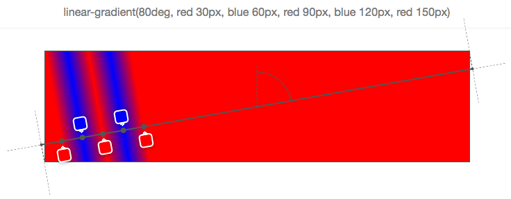
As you can see, each of the 5 color stops have positions, in pixels. These positions are calculated from the start of the gradient line.
Using these positions, you can come up with all sorts of nice effects. One thing you can do for instance is use a gradient to not draw a gradient at all, but have multiple colors:
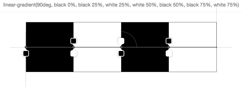
In the above picture, there are 7 stops, and they are organized in a way that the next color starts exactly at the same position as the last one which means that the browser doesn’t have to fill the space between 2 stops with a gradient of colors.
But of course this is all nice and fun, but what happens if you mix positioned stops with un-positioned stops? Then you make the browser work some more and ask it to distribute the stops for which you omitted a position automatically:
In the simple example above, the 2nd stop (orange) has no position, and so the browser makes up for it and finds the right place between the previous positioned stop and next positioned stop. Here it’s very easy because the immediate neighbors of the 2nd stop have positions, but it gets more complex if only a few stops have positions, or if there are no previous or next positioned stops.
Let’s take a look at a few examples:
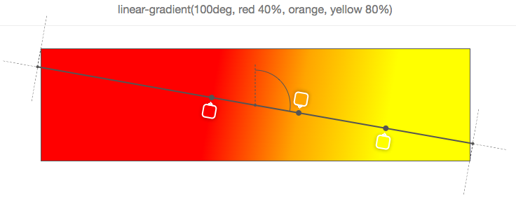
Above, only the 3rd stop (yellow) is positioned at 30%. So to nicely distribute the rest, it puts the first one at 0%, the last at 100%, and distribute the stops in between at mid-positions (so the orange ends up right between 0% and 30%, and the red ends up between 30% and 100%).
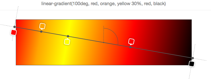
Above, the first and last stops are positioned, so the rest is distributed evenly in between those two.
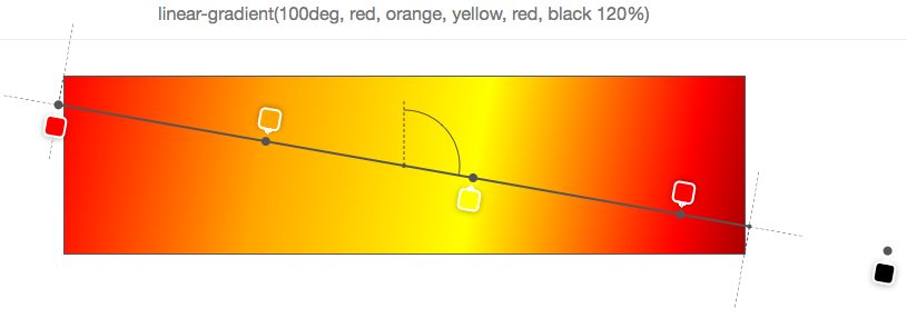
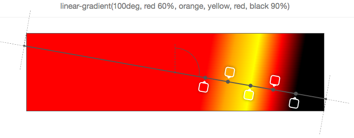
Of course it would be too easy if 0% and 100% was a hard range you couldn’t go out of. But as seen in the previous example, the last stop is positioned at 120%, and so all other stops have to be distributed according to this position (the default start position remains 0% in this case).
And if you want to make your browser work even more, why not specify out of order positions?
Indeed, color stops are expected to be ordered, but nothing prevents you from not doing it, and nothing horrible is going to happen if you don’t. Your browser is simply going to correct you, as seen below:
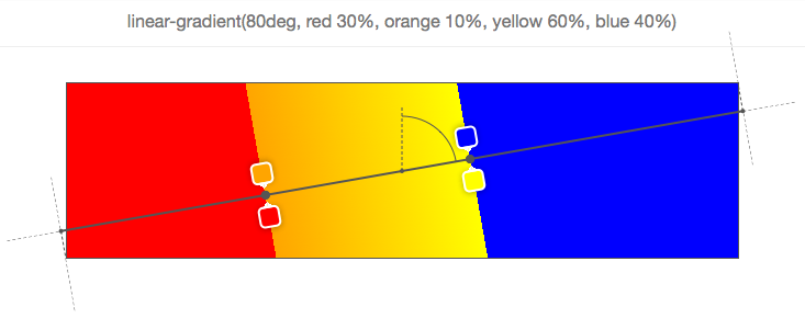
Let’s start from the first stop (red), positioned at 30% which is fine, then the second stop is positioned at 10%, which is wrong because, as said above, stops are supposed to be given in increasing positions. So here the browser corrects the second stop position and sets it to the same position as the preceding positioned stop (30%). Then comes the 3rd stop (yellow), at 60%, which is fine, but it is followed by the 4th stop (blue) at 40%. So there again the position is corrected and set as the one of the preceding positioned stop.
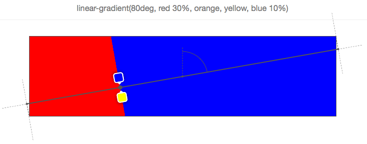
Finally, in the above example, the last stop (blue) is incorrectly positioned and so the browser sets its position to be the same as the preceding positioned stop, which in this case is not its immediate neighbor (yellow), nor the stop before that (orange), so it has to go all the way back to the 1st stop (red). Therefore, all stops between red and blue are also given the position 30% and are therefore not visible.
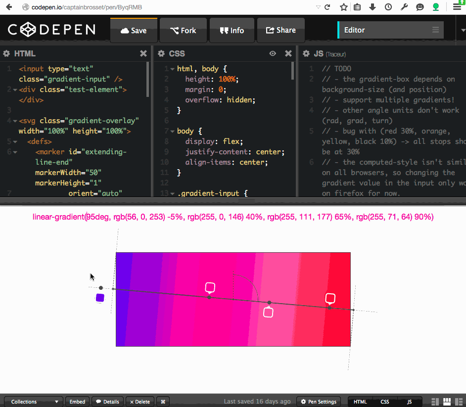
Tooling
All the screenshots in this article are from a simple tool I made on codepen which lets you input a linear-gradient function and see the gradient box, gradient line, angle and color stops information as an overlay on top of the element.
There’s all sorts of bugs and limitations in the tool (see the TODO comments in the javascript), so don’t expect too much ☺